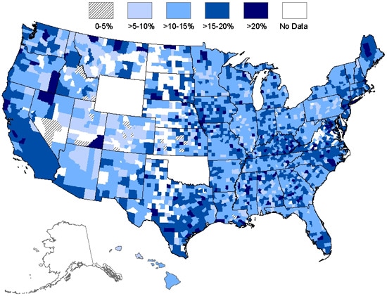
Chloropleth Map:
Dot Density Map:

A Dot Density map uses a symbol, generally a dot, to illustrate the distribution of some phenomena. Here the Dot Density map shows the total number of West Nile Virus cases in the U.S. from 1999-2008. The density of the dots allows us to understand the magnitude of the virus.
Proportional Symbol Map:

A Proportional Symbol map uses different sized symbols to represent data. Here the size of the cows increase as the number of cows increase---I know this map seems random, but cows are CUTE! and who doesn't love a good glass of milk?!? :)
Topographic Map:

A Topographic Map is very detailed using contour lines. This is a map of Chattanooga.
Environmental Sensitivity Index Map:

An ESI map is used to illustrate coastal shoreline sensitivity, for example, to be used in showing oil vulnerability. This map is of part of the Point Reyes National Seashore.